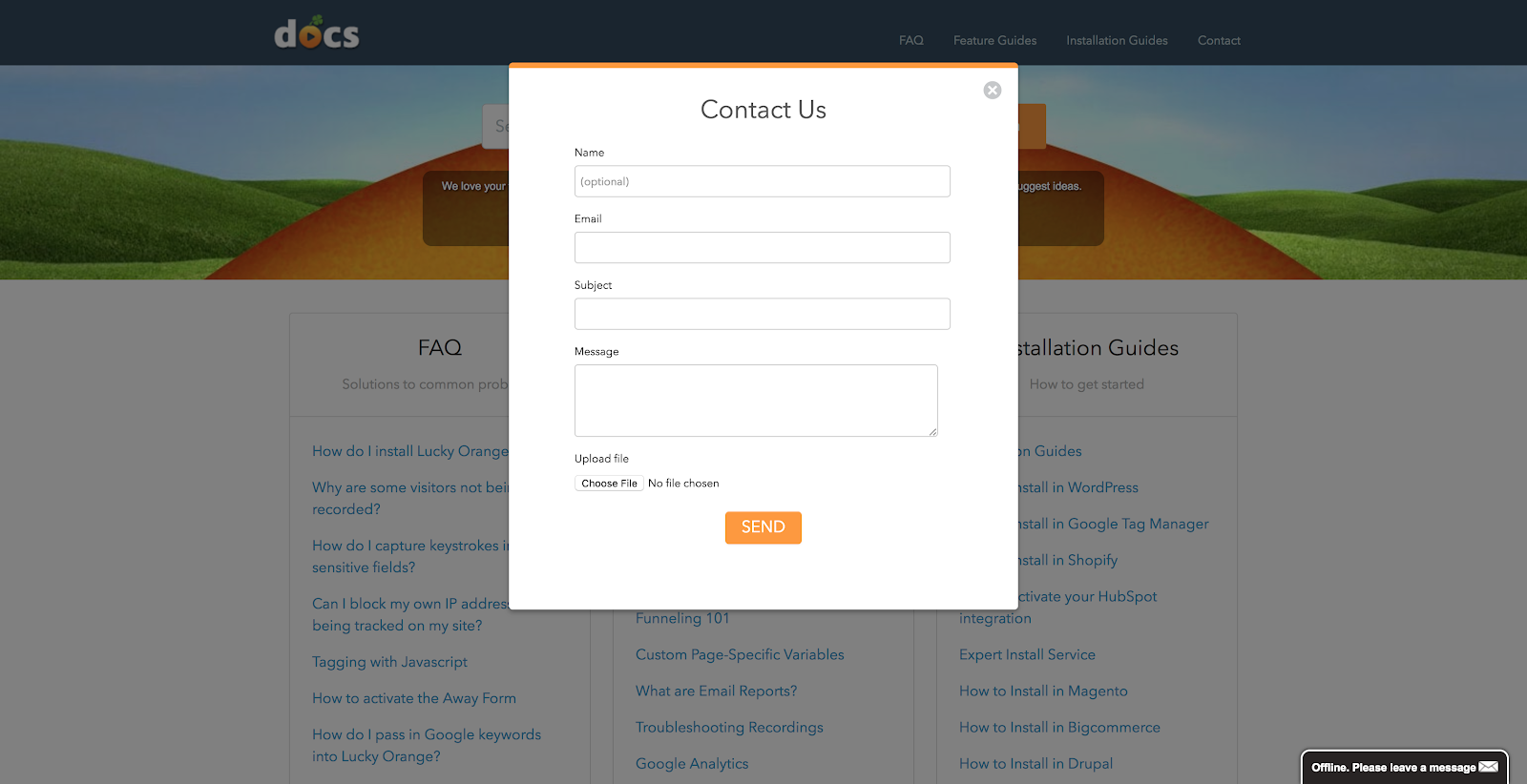
Contact forms can get you more qualified leads and sales.
Especially if they’re set up the right way.
If you’re looking for the best contact form design ideas to spice up your contact page and boost conversions, I wrote this post with you in mind.
According to The State of Email Lead Capture 2020, “74% of companies use contact forms to generate leads. 49.7% revealed that their contact forms are their highest converting lead generation tool.”
Far too many SEO & PPC professionals, marketing agencies, and web designers don’t prioritize their website contact form design. They often pay more attention to the website’s homepage, sales pages, and blogs. This means that they’re leaving a number of leads on the table.
The contact form (also referred to as a web form or lead form) is arguably the best area of a website to capture more leads. For most companies, it’s probably one of the most-visited pages.
For example, suppose you’re looking for a quote from a local roofing company. There’s a big chance that you’re going to fill out a contact form to get in touch.
You may not even care if the roofer has a Facebook page or Twitter profile. You want to send a message quickly via their contact form — which is typically attached to their primary email address.
Your contact forms should never be a major leak in the funnel. It’s time to make it a top priority.
Content Form Best Practices
In this section, we’re going to discuss what Makes a Good Contact Form.
Not all contact forms are created equal. I’m sure you’ve seen some boring and long contact forms as well as some irresistible contact forms that made you take action.
These contact forms best practices will guide you accordingly. These are not standard rules but guidelines to help you design a conversion-focused contact form that will grow your leads and sales for any website contact page.
Let’s go through some contact form best practices:
1). Easy to find: Make sure your prospects and customers can easily find your contact form from any page.
Don’t restrict your form to just the contact us page. For example, at LeadForms, we created a widget that enables you to add a contact form to any page of your site.
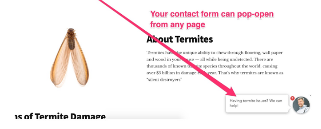
Note: When you click on the widget in the bottom right, it can pop-open a clean and interactive Lead Form. With this on your pages, it means you can capture more leads in less time.
2). Have a clear purpose: Your contact form should clearly explain why prospects should fill it and how they can get answers to the visitor’s questions.
3). Include adequate form fields: Both short and long forms can work — depending on the circumstances and goals.
Hence, your contact form should have form fields that will help the business pinpoint who’s contacting them and why. Keep your form clean and straightforward. No fluff!
4). Call to action: A call-to-action (CTA) is important because it entices the visitor to complete the form. Avoid using generic words like “Submit.” Instead, say something like “Get My Quote.”
5). Redirects to a “Thank you” page: This page should explain when and how you’ll be getting back to the prospects who filled out the form. You might include links to helpful resources to help the prospect in the meantime.
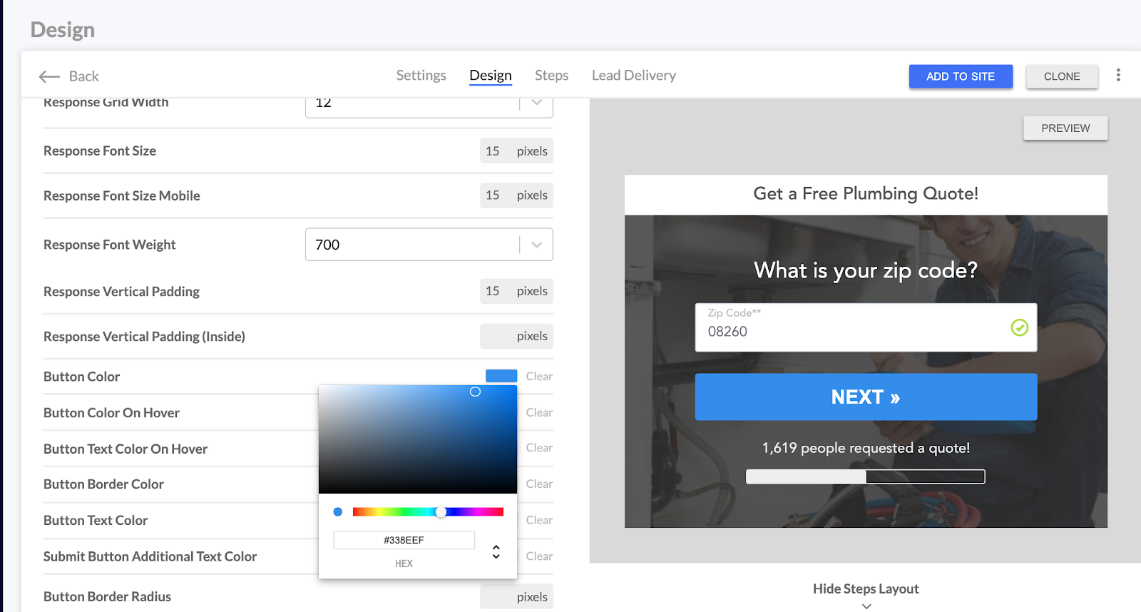
6). Includes a Progress Bar: If you’re using a multi-step form then it’s a great idea to show a progress bar so the prospect has a visual cue into when they will reach the end of the form.
7). Shows Your Image : A little known, but powerful thing that we learned at LeadForms a while back — grab your phone and take your best selfie then add your image to your form like below.
An image makes your form appear more friendly. As a result, conversions will skyrocket.
8). Is Personalized One of the problems that most forms have is that they just aren’t personal enough. That’s why at LeadForms, we created a whole new way to personalize your forms with a feature called Personalization.
For example, let’s say that you’re using a form with multiple steps and your form asks for the first name.
To make your form more personalized you can simply add the variable {name_first_name} to your contact message like below:
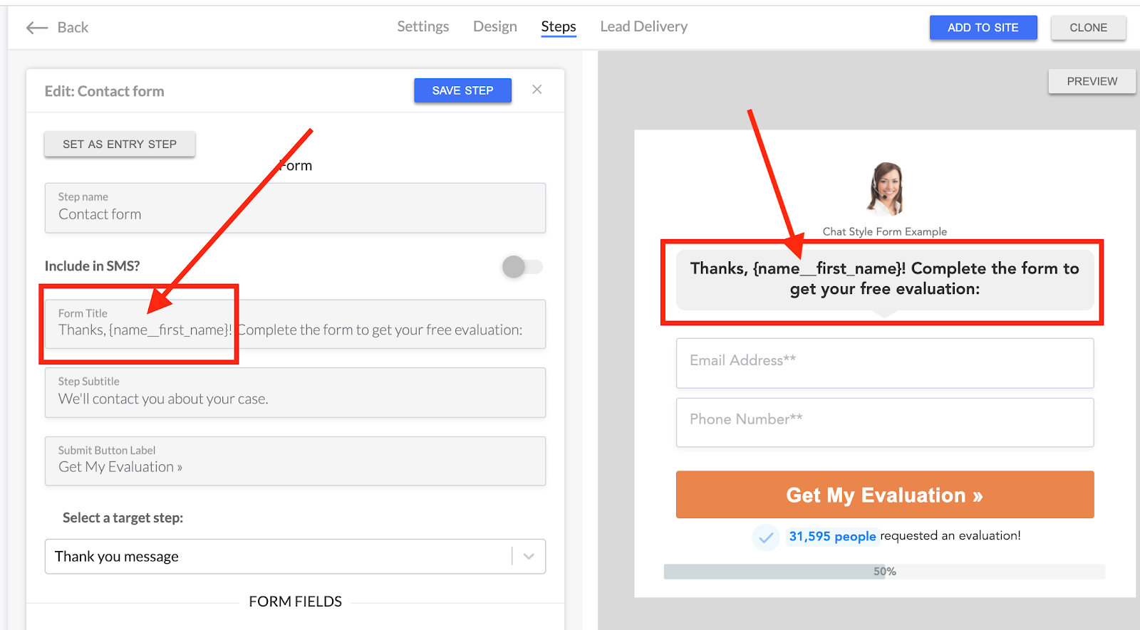
After someone inputs their name (Let’s say “Mike”) your form will look something like this:
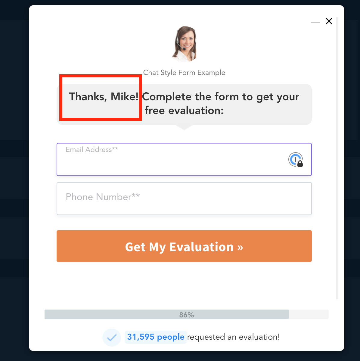
So instead of a generic message that says, “Thanks! Complete the form to get your free evaluation.” You can have the form repeat the lead’s name so it says Thanks {NAME}, Complete the form to get your free evaluation”.
This is a game changing personalization feature that we built into LeadForms. You can try it for yourself here.
Short Contact Form Design Myth: Debunked!
When creating a Lead Form, many experts advise you to keep your contact form short. But this advice should be taken with a grain of salt.
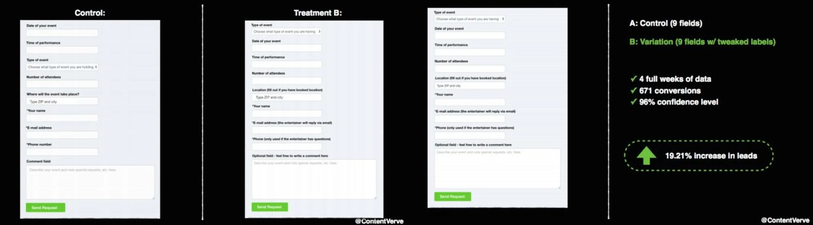
Don’t sacrifice data quality for conversions.
Michael Aagaard increased conversion rates by 19.21% by simply using many optimized form fields in his contact form. The ultimate goal is to make it easy for the prospect to supply as much info as possible.
One way to capture more data is to use multi-step forms. At LeadForms, we make it easy to build multi-step forms with LeadForm Templates. These forms are high-converting interactive forms that help you convert more website users into leads.
9 Contact Form Design Examples (For Your Inspiration)
A well-designed contact form will entice and engage your visitors, nudging them to take action.
In turn, this will improve user experience and nurture a strong relationship with your leads.
In this post, I’ll share 9 contact form examples with multiple elements that you can include (or remove) from your Lead Form page. Ready? Let’s dive into some of the best contact us pages!
1. A Great Example Contact Form: HomeAdvisor
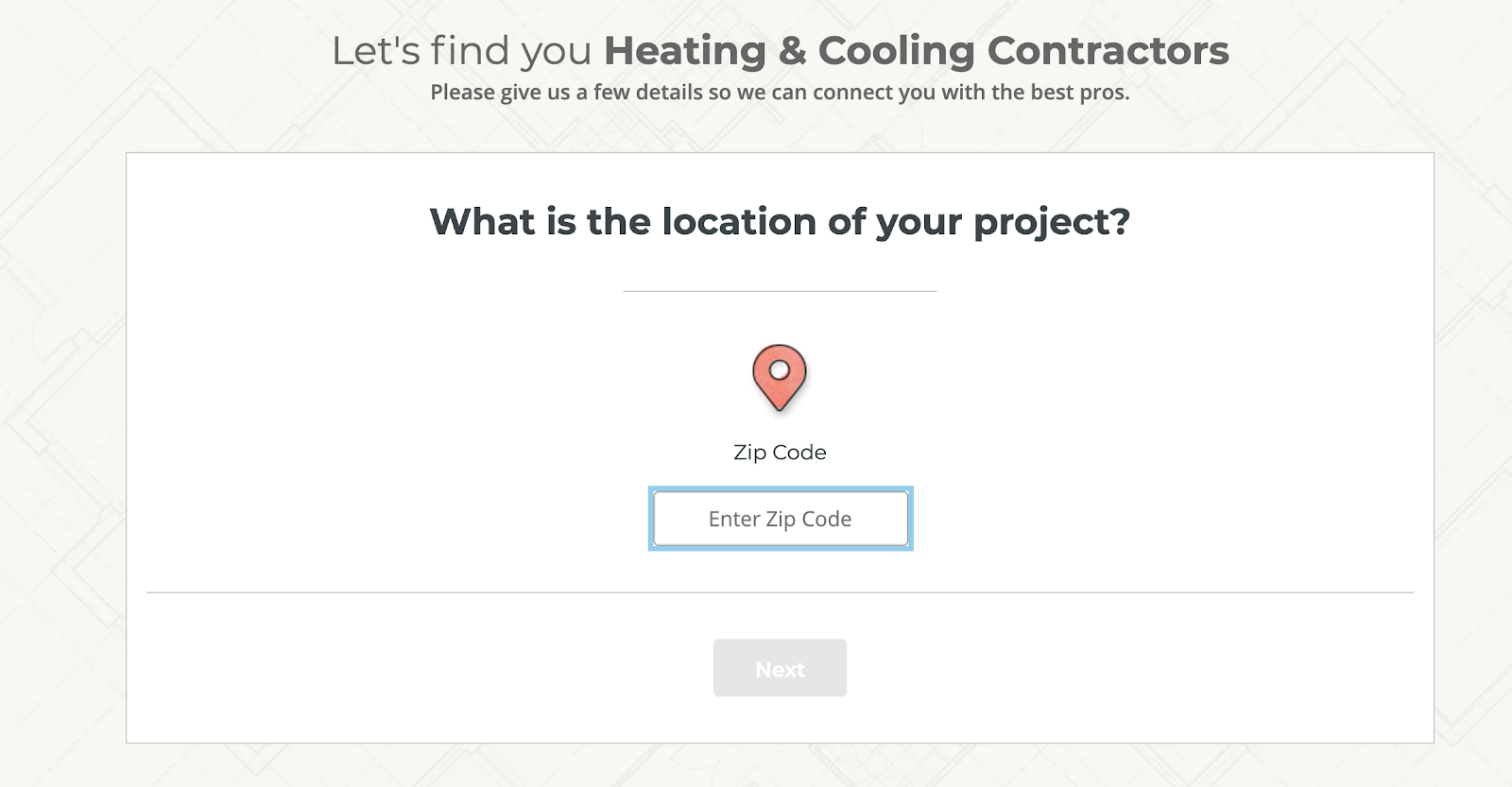
Let’s start with a contact form example from HomeAdvisor. This is a simple form that makes the user feel relaxed by starting with just one simple question — what is the location of your project?
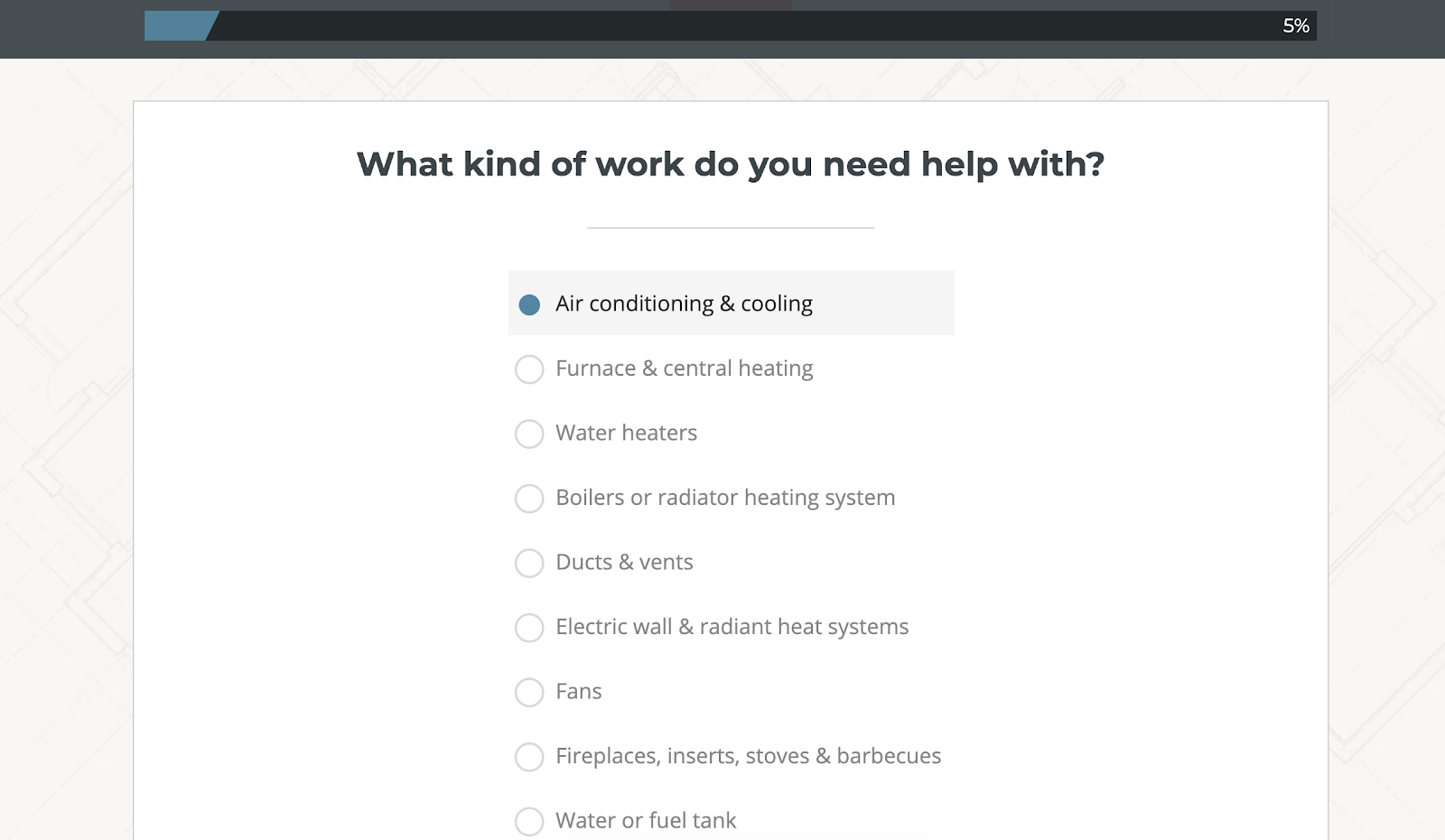
Next, Home Advisor begins to ask additional questions about the project, enabling their team to get as much information as possible about the lead.
Finally, once Home Advisor gets all of the information that they need, they ask for your contact info.
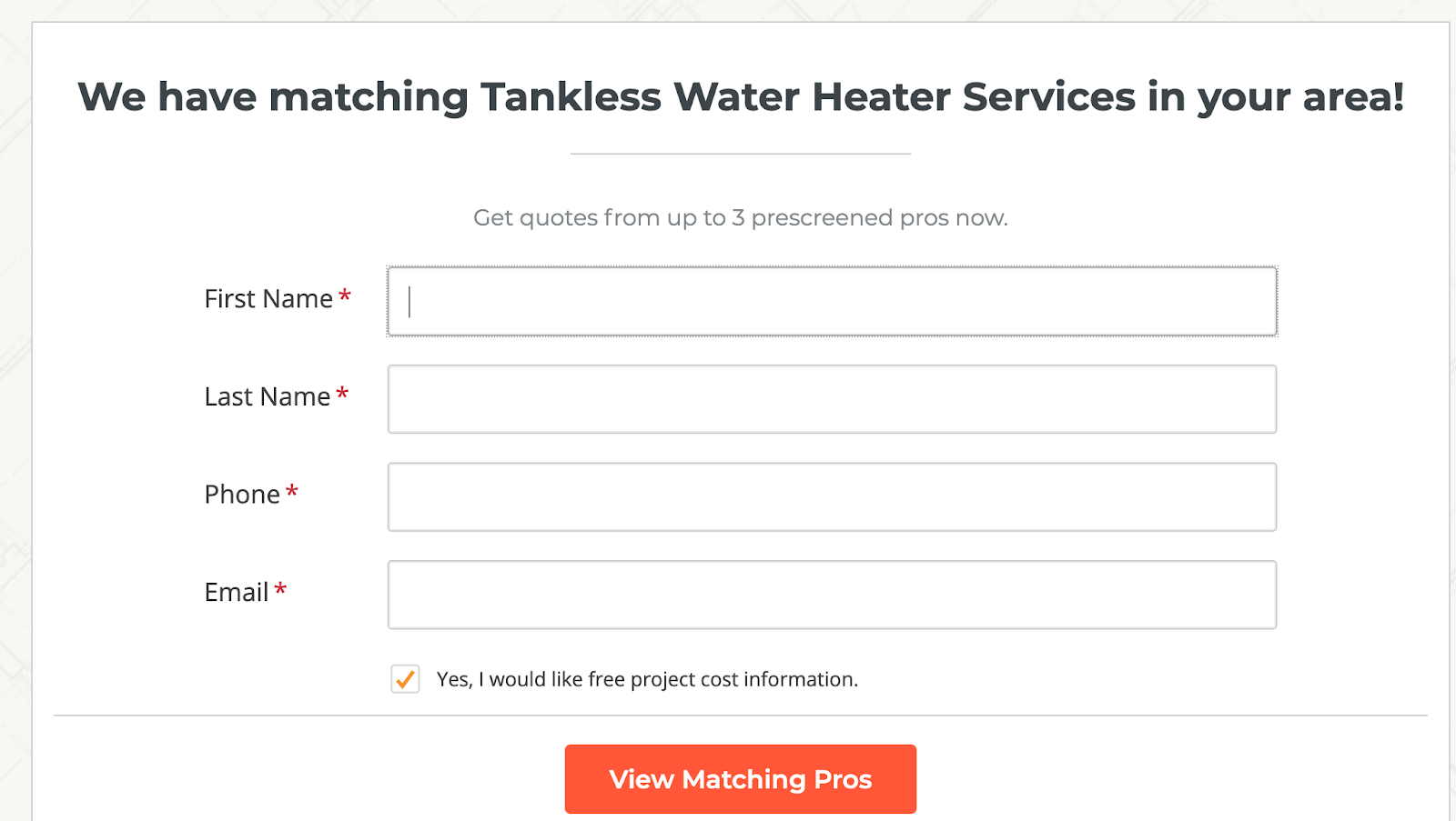
By this point in the form, the prospect has already answered over nine questions!
Since they committed their time to answering all of the questions they are more likely to follow-through on the final step and provide their contact information.
This is the benefit of a multi step lead form.
With all of that said, HomeAdvisor is a pretty sophisticated company. In fact, they have a team of developers who can quickly build advanced multi step forms like the one in this example.
If you’re a marketer or business owner, then chances are that you do not have the resources to build a form like this. That’s why at LeadForms, we created a simple way to build multi step forms like Home Advisor without having to hire a team of techies to do it for you.
With our multi step form builder, you can quickly build interactive Lead Forms like HomeAdvisor. Start your free trial here.
2. Zendesk’s Contact Us Page
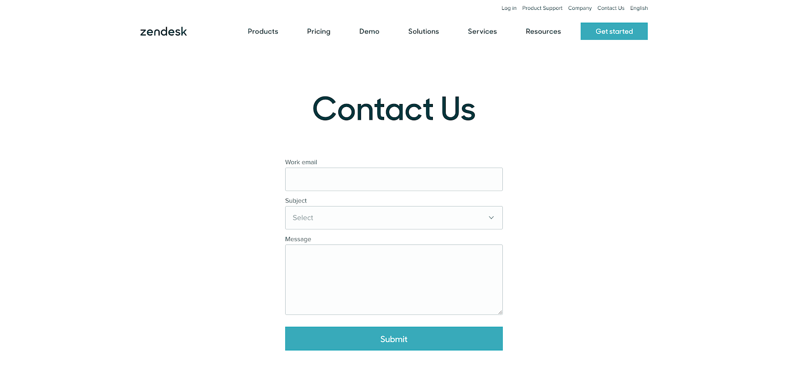
Another great contact us example is from Zendesk. When you head to their contact page, you’ll see a form that hits all the major needs of the visitor.
It has a clean design.
Also, users can contact product support and access location information with a map — right on the page.
The contact form has an attractive call-to-action “Submit” button. Although it lacks the visual cues to guide the user, it’s self-explanatory and users will not struggle to complete the form.
What can you learn from this contact form? Well, it’s simple and professional. It can be a good starting point. However, you can infuse your personality and branding to spice up your contact page a bit more.
3. Pest Control Allentown PA
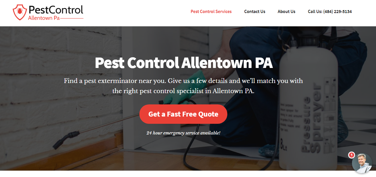
Pest Control Allentown PA uses a smart contact form design. When you first land on the homepage, a popup appears — letting you choose what services you want.
Users can click anywhere on the page to open the form.
Before users can fill out the contact form, they have to choose the service they need first.
By simply clicking on the “Get a Fast Free Quote,” a prospect will see this popup. They can choose what services they want to get started, and follow the prompts.
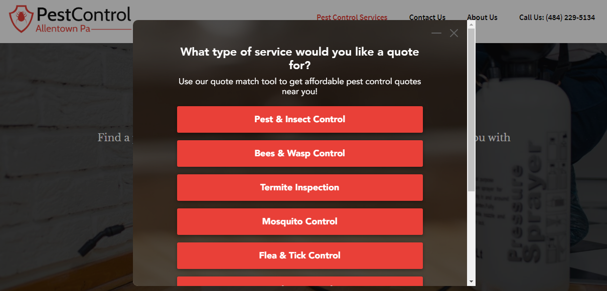
When users are asked to supply their Zip Code, there’s social proof that says “11,605 people requested a quote” at the end of the form. This is a powerful hook, which can encourage prospects to continue.
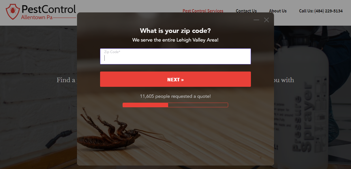
This multi-step contact form is unique, converts 86% higher than a traditional form, and is easy to create from scratch using LeadForms. You can get this template here.
It takes the prospect/user on a journey. It’s all about getting to know the prospect better, so you can serve them with the right quote or information.
4. Stripe’s Contact Form Design
Here’s a great example contact us page from Stripe.
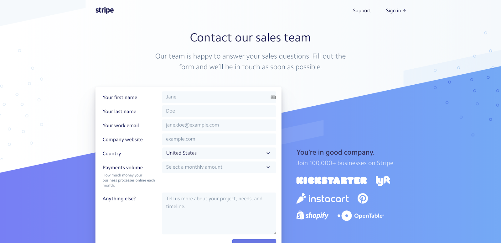
Stripe’s contact page design has a clean and minimalistic feel. On this page, visitors can quickly see how they can reach out to their team. The copy on this page is warm and friendly.
In addition to this customer contact form contact form design, Stripe also features some of the companies they work with right next to the form.
This is a form of social proof. New prospects and customers will think “If these big companies trust Stripe, I should too!” That’s why this is a perfect example of a customer contact form.
Social proofs like company badges and logos help to remove any objections a visitor might have about Stripe.
Social proof can really boost conversions. That’s why we give you the option to add social proof to all of your LeadForm, like below:

So if you’ve got it, hone it! Adding that extras right next to your contact form can increase your brand’s credibility.
5. LeadForms’ SaaS Pricing Form
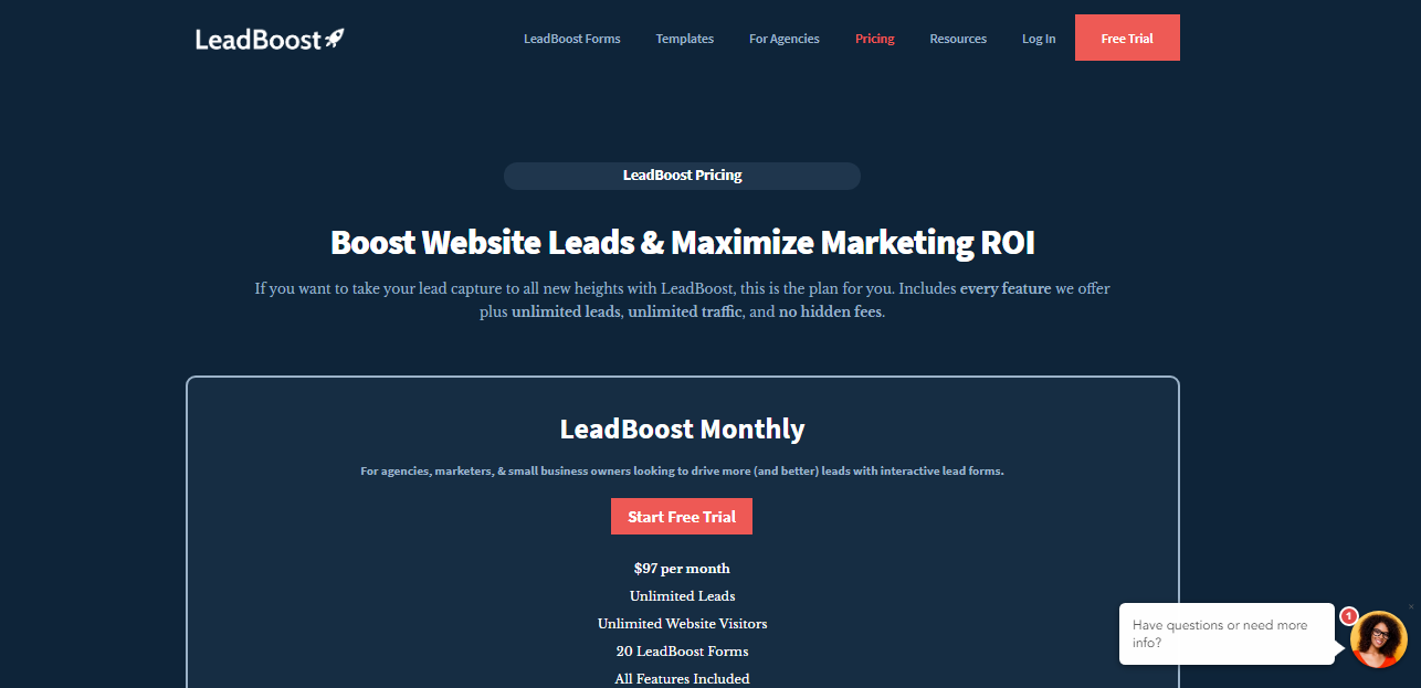
When designing your contact form, you need to make sure it’s compelling and relevant to what users want.
We designed the LeadForms‘ pricing page to provide prospective customers with all of the key features of our LeadForms.
We also field any additional questions the user may have with an interactive chat-style form — right on the pricing page.
This can be a great alternative to live chat if you’re currently not offering that on your site. Get the template here.
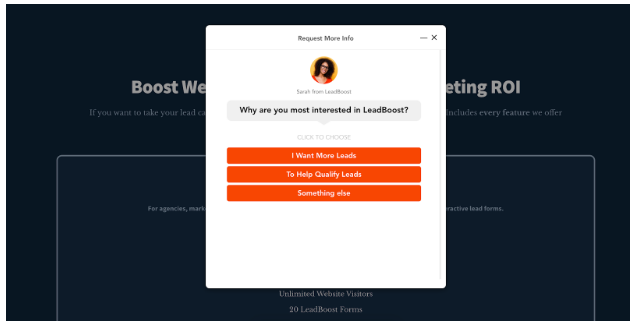
By testing the elements in the above contact form, we were able to boost conversions by 38%. Many of those who filled the form became customers.
Imagine how many leads we’d have missed if they didn’t have a way to contact us right on our pricing page. .
6. Home Loan Analyst’s Contact Form Pop Up
Here’s a very modern Lead Form from Home Loan Analyst
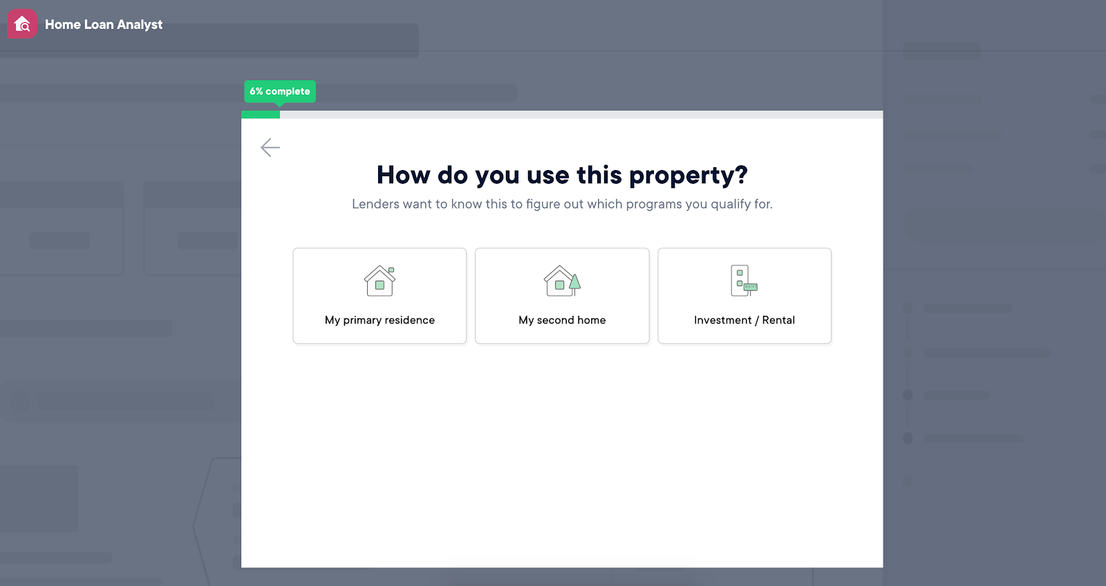
Don’t let this form’s simplicity fool you. HomeLoanAnalyst has taken it to a new level.
Just like HomeAdvisor, they break their questions into multiple steps – showing only one question per step.
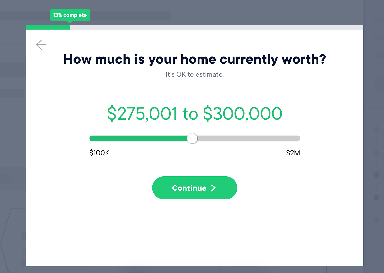
This contact form keeps the user engaged and focused, while allowing their form to collect as much information as possible.
This helps the company to understand who the prospect is and what they want. So that their questions and feedback can be directed to the most appropriate department.
Everything from the contact form fields to the call-to-action button is styled and branded. The user is expected to go through the whole “experience” when filling out a form.
This is a great example of a mortgage lead form — try out this template for inspiration!
Many businesses try to build forms like this using TypeForm. But when it comes to building a really slick, high converting lead forms, there are better alternatives, such as GetLeadForms.
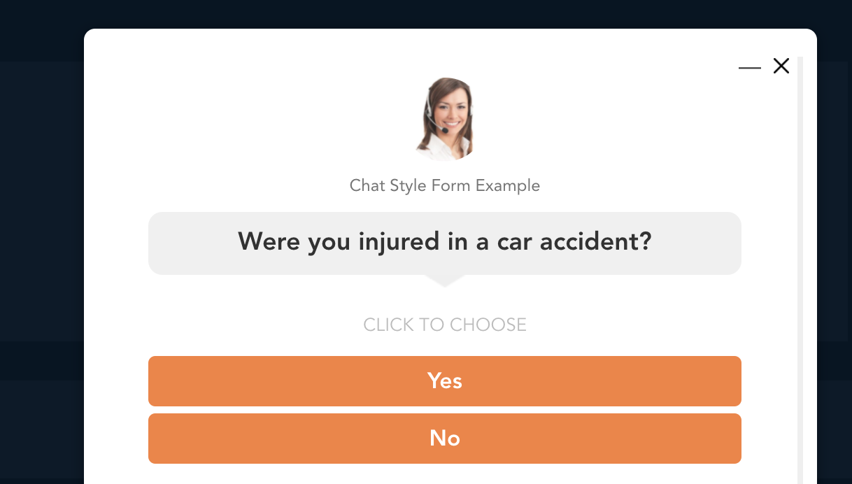
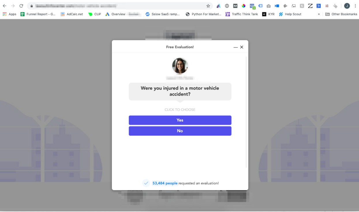
7. Personal Injury Contact Form Design Example
Here’s an interesting approach from a personal injury firm:
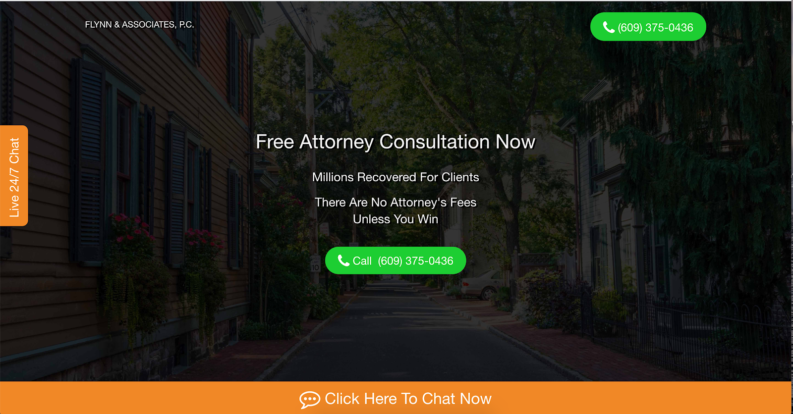
When you tap “Click here to Chat Now” in the big orange bar at the bottom of the page, a chat window opens.
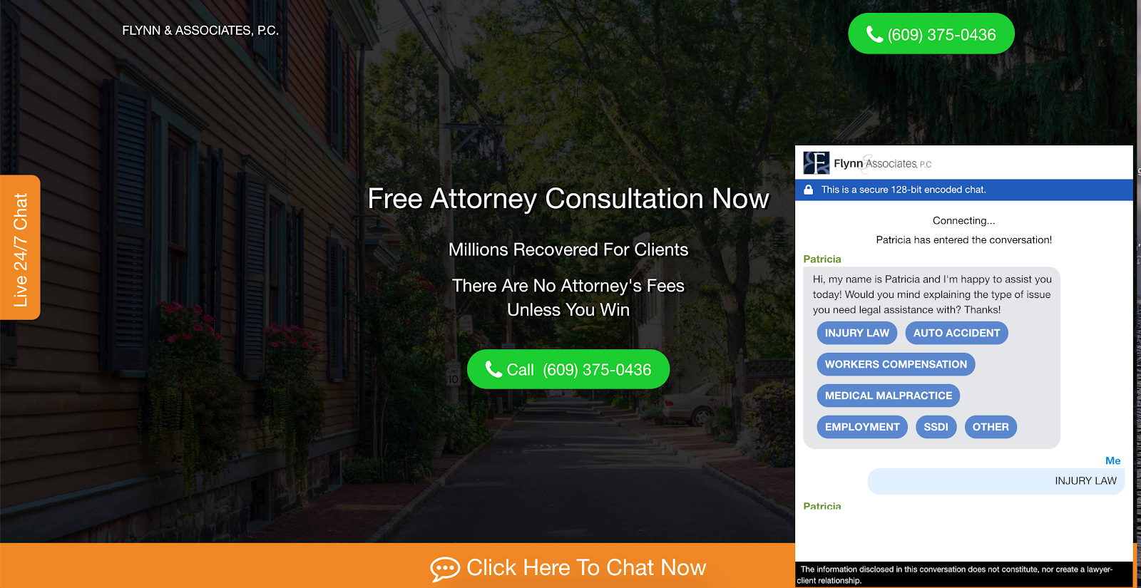
While it’s not quite a contact form, Flynn & Associates seem to have replaced their contact form with a Chat Bot / Live Chat Tool.
It’s a very interesting approach, the only downside is that the user-experience of the chat tool is kind of strange. I personally found the form a bit hard to type in.
In fact, here’s a much better way that this law firm could set up their form:
This chat style form isn’t quite a Chat Bot or live chat tool, but it is a great chat bot alternative. Leading search engine marketing firm, Ignite Visibility uses this for one of their clients and they see some pretty impressive results from it. You can read the case study here.
8. Lucky Orange Web Form Example
I’m excited about this contact form example.
You’re presented with a pop-up contact form. It’s non-intrusive. That means you have control over the form.
If you’re not ready to contact the company right away, simply click away from the popup modal and choose an option to continue.
More so, there should be a way for users to bring back the popup contact form again, supposing they ignored it previously. It shouldn’t be a “use it or lose it” scenario. This would be very frustrating for some prospects.
The only other way to make this form better is to break up some of the questions and to have the form be a bit more interactive, just like the form below.
9. KlientBoost
For the agencies out there here’s one to model.
KlientBoost has a pretty impressive multi-step form.
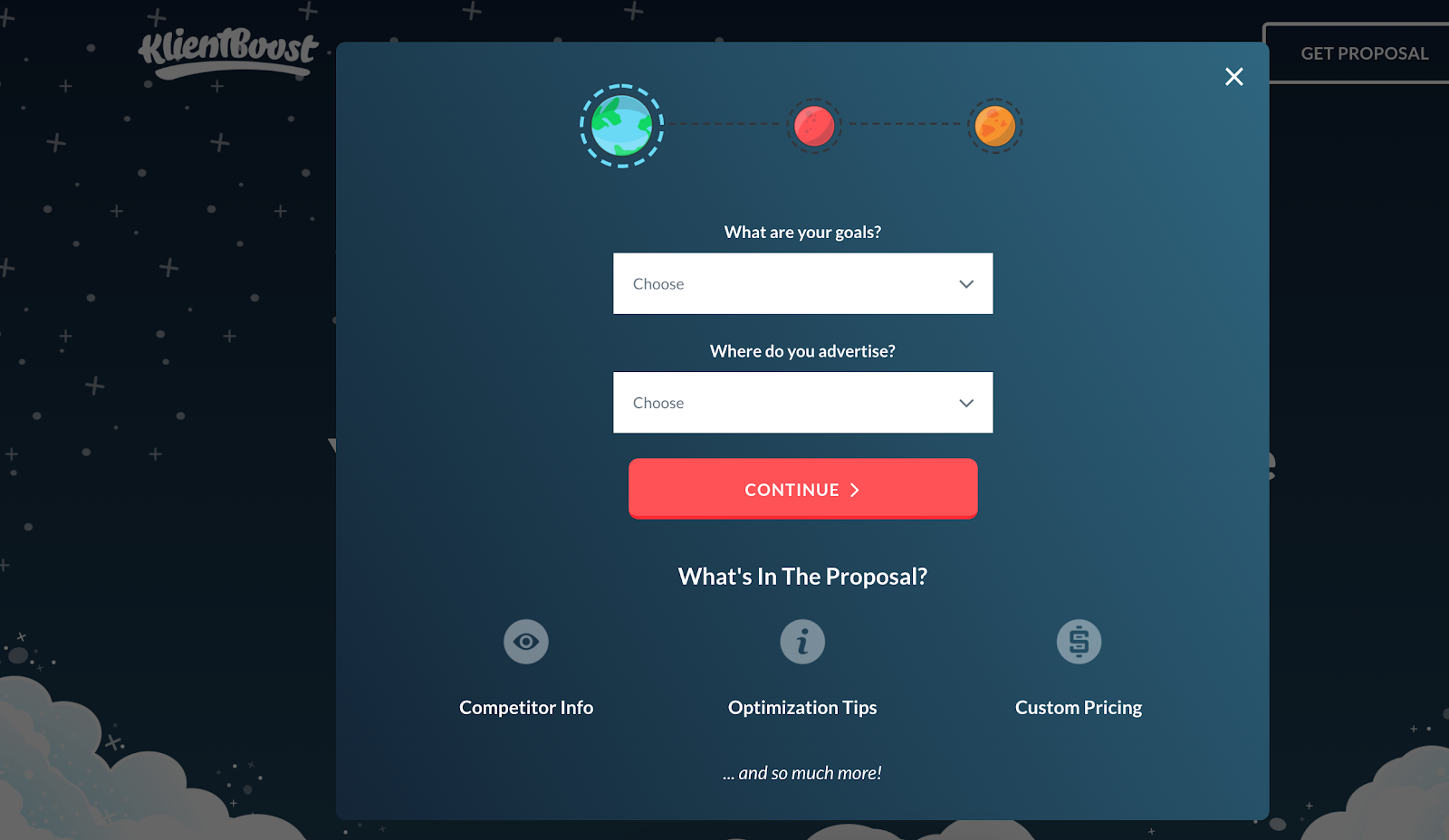
The CRO geniuses over at KlientBoost, not only do a great job of matching the branding to their site, but they also take the multi-step form approach – breaking each question into multiple steps.
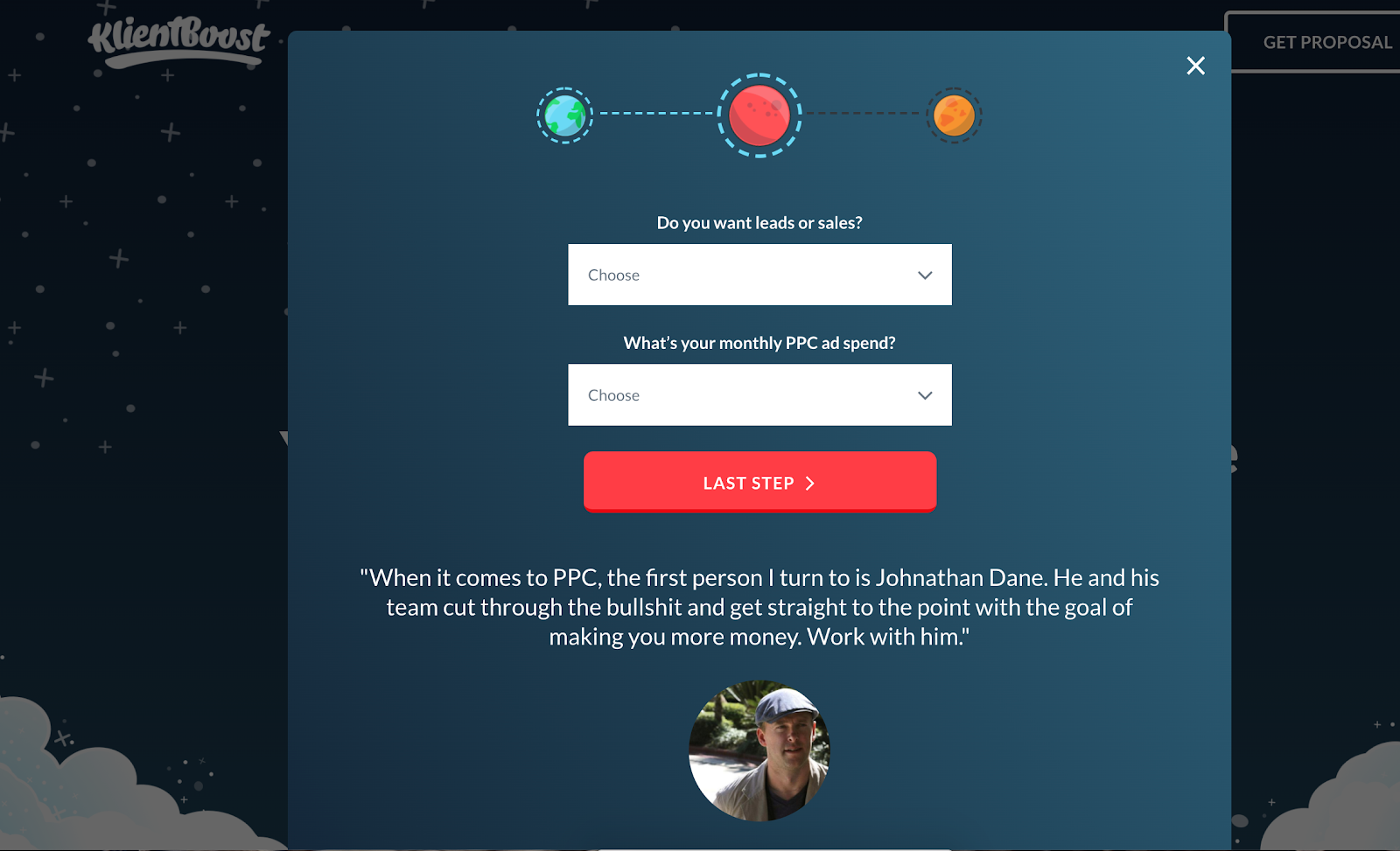
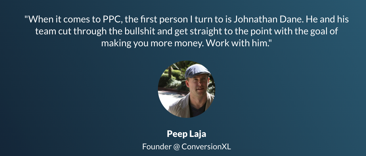
What’s also interesting is that they have a quote from Peep Laja of ConversionXL right at the bottom of the form. I’m guessing that this piece of social proof probably causes conversions to go through the roof.
Great job KlientBoost!
If you’re an agency then you can get a similar form to the one that KlientBoost uses here.
What To Do Next
As a marketing agency, you don’t need to build complicated sales funnels and dozens of landing pages to get more leads for your clients. All you really need is a good contact form.
If you’re looking for contact forms for your websites, you just need LeadForms Sign up for a free trial.
At the end of the day, you should be focusing on how you can be more helpful to your site visitors and prospects.
Make the process of filling out your contact form as easy as possible for the user. Always set the right expectation for when you’ll get back to them.
Get started with LeadForms to design your contact forms. Pick a template and customize it to suit your website or brand — make it yours!